Ditch “Above the Fold” Thinking
The layout of your website’s homepage is an important factor in ensuring users stay on your site and find the desired information. A common design question that arises is whether scrolling on a website’s homepage is a beneficial design practice, or if it is better to keep all information at the top of the page or “above the fold.”
What is the “fold?”
The term “above the fold” comes from the newspaper industry. Since newspapers were folded in half, designers had to use the top fold of the paper to grab the reader’s attention. The term slowly made its way online over the years, and people still refer to the practice today.
Designing for today’s internet user
Today’s online users have very different habits than those that read newspapers, and a lot of traditional design methods are no longer relevant. It’s important to think of your website as a comprehensive overview of your practice, guiding users along clear paths to find the information they are seeking.
Users today prefer a clean website design, as opposed to a cluttered site that leaves them overwhelmed. Cramming too much content at the top of the page becomes confusing and users are unable to make a decision as to where to click. Studies show that it is easier and requires less thinking by the user to scroll down a page and view blocks of information versus having too many options available that force you to click through to smaller pages. There is no longer a need for you to place as much information as possible above the fold of your website.
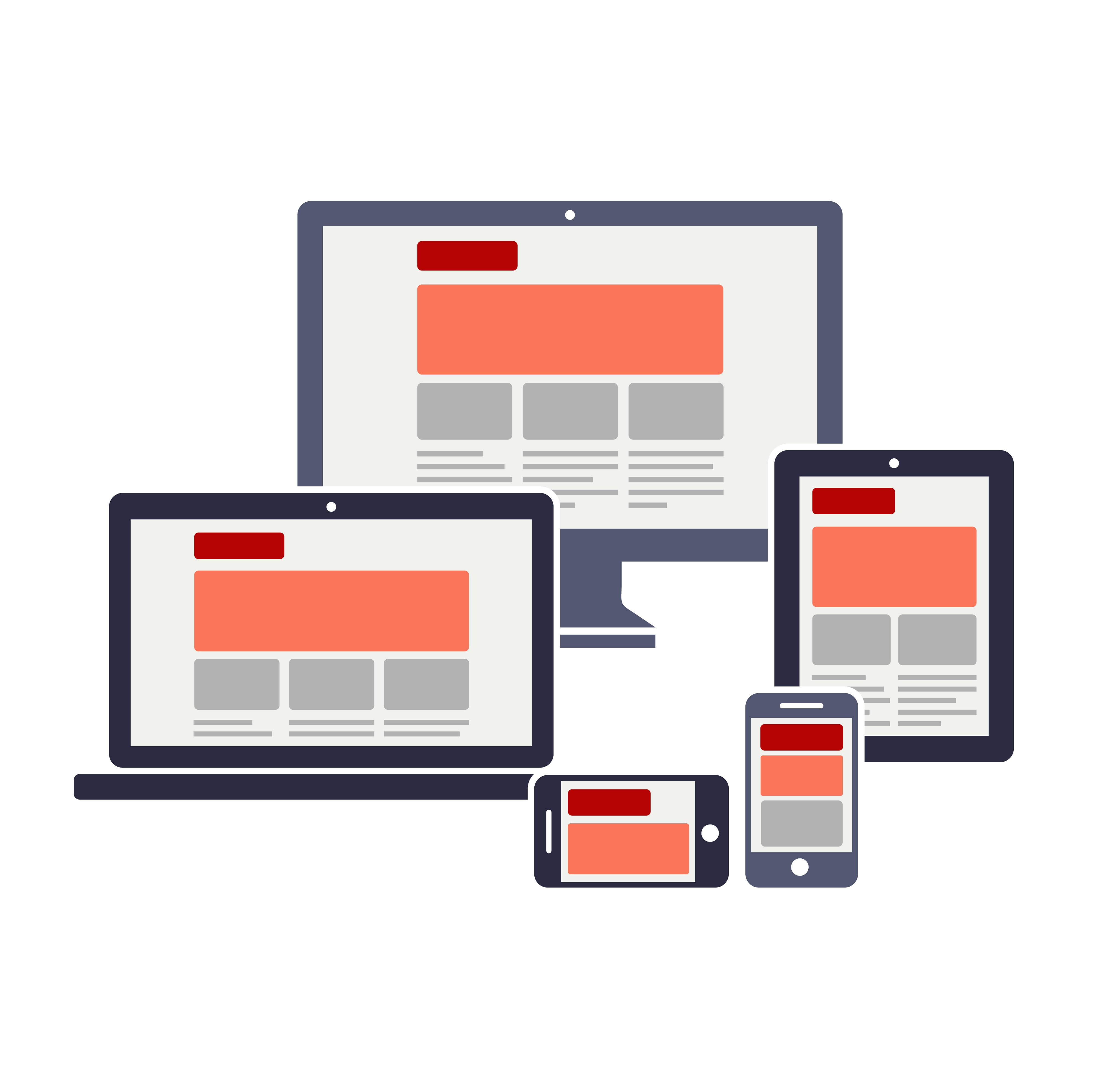
Also, various screen sizes mean that the position of the fold moves, which is why this area is no longer used in the same way. However, it’s important to be strategic about the content you place both above and below the fold.
Above the fold
The area above the fold should give users a great first impression of your brand and should include user-friendly navigation, quality images and media, and excellent copy that will encourage users to interact and scroll down the page.
Below the fold
Place more detailed information below the fold, including callouts about your staff, product information, testimonials, services information and a map callout. This is also a great area to place a call to action or lead generation button as you will have already enticed the user with information about your practice, products and services.
It’s important for all business owners to keep up to date with changes in the digital space so that your website is always catering to the ever changing needs of the online consumer. Is your site in need of a refresh? Contact us today to get started.

